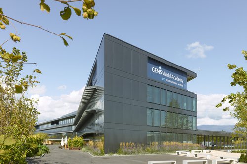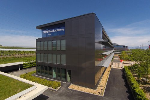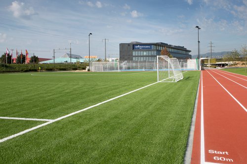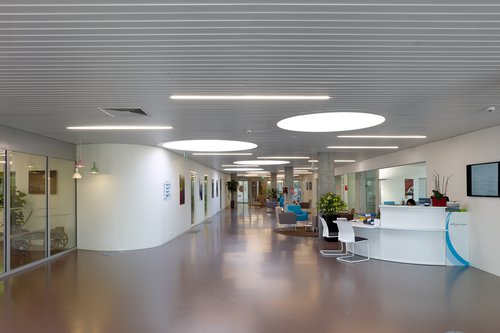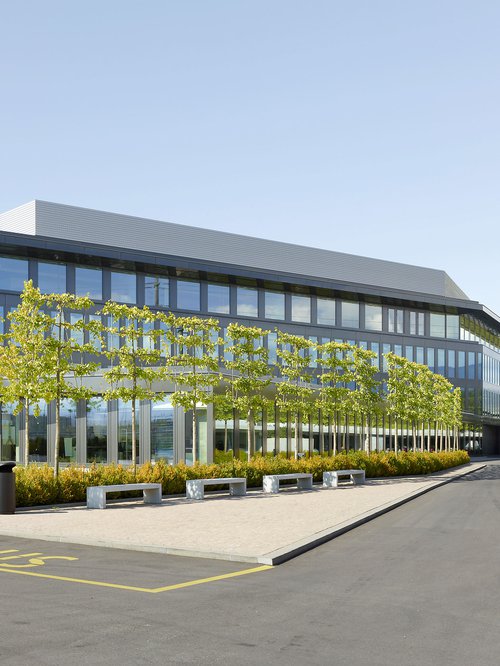
Located in the commercial area of Etoy, this new building was originally designed for administrative areas. The building was adapted to accommodate the first Swiss branch of the GEMS private school network. The project is primarily didactic, personalized and animated. Emphasis is placed on exchanges and group work, hence the development of numerous common areas.
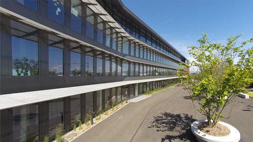
This Minergie-labeled project features steel-aluminum anthracite facades, punctuated by triple-glazed bay windows. For thermal reasons, a double skin covers the faces facing west and east. A permit application was made in July 2012 for the change of use and the addition of a third floor.
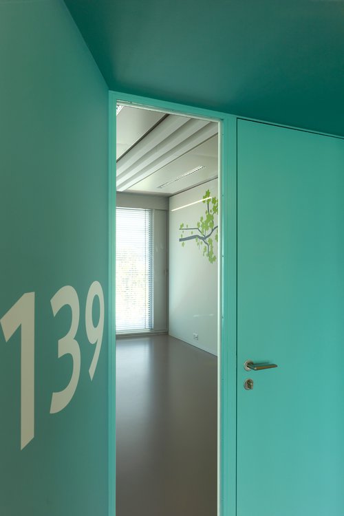
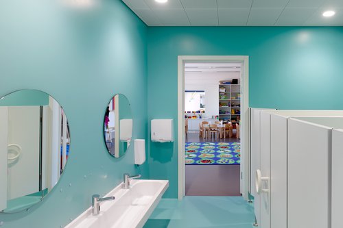
The toilet blocks are the same color as the entrance door, allowing children to better orient themselves in the building and make them more autonomous. The coloured additions are also signage and bring a particular and dynamic rhythm.
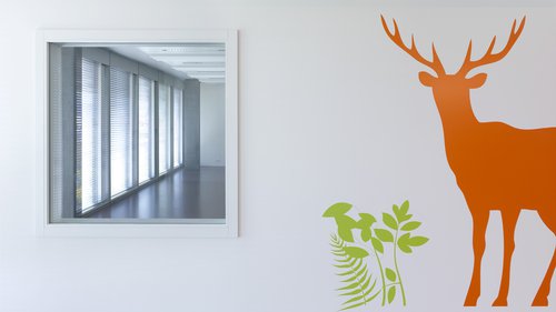
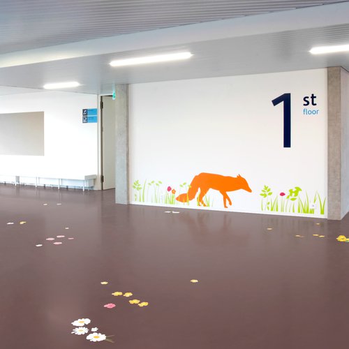
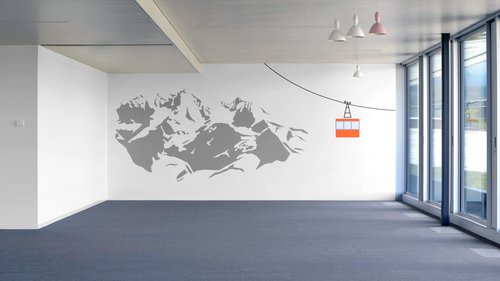
Graphic interventions on the walls and ceilings dealing with the different branches of education underline and give added value to the project.
Year
2014
Developed by
CCHE Lausanne SA
Client
Architecture: Meigerhorn Asset Management SA
Interior design: Group Aerium et GEMS World Academy
Program
Architecture: Transformation of an administrative building into a school building
Interior design: 48 classrooms on 3 levels (kindergarten, primary, secondary), common areas, special rooms, dining room and production kitchen, library.
Floor area (GFA)
12,000 m²
Volume (SIA)
53,000 m³
Realization
CCHE Lausanne SA
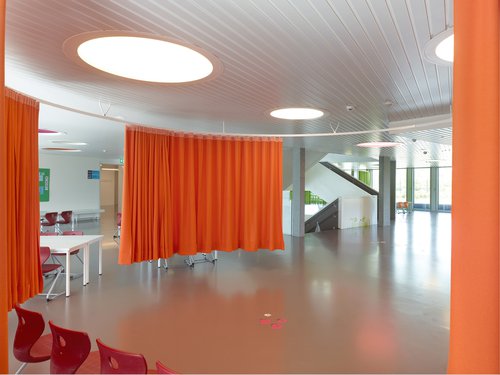
Free flow furniture freely placed in the space gives back a human scale.
In each classroom, a window at child's height allows visions of the common space and offers a new pedagogical approach.
It can be divided into several places by means of colored curtains so that it can be put at the child's level. Between 2 classes, a common open "pocket" brings natural light into the corridor and offers the possibility of different activities.
A monumental and sculptural staircase in the middle of the building allows exchanges and visions between floors. The meeting space located on each level around the central staircase is an important living space.
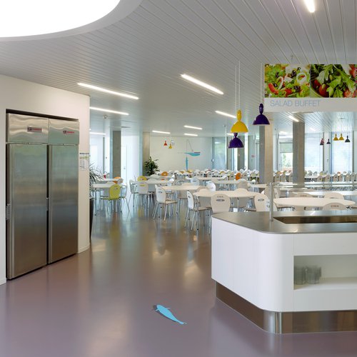
A huge cafeteria located at the entrance of the building with a capacity of 300 students is subdivided into different areas adapted to the age of the children.
Graphic interventions dealing with different subjects such as biology, literature, art, sport and music, in a playful and didactic way while dressing the space.
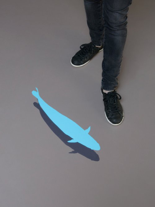
These punctual interventions play with architecture as well as with the place to which it relates. For example, illustrations about fish and fishing in the cafeteria.
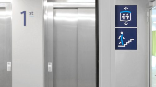
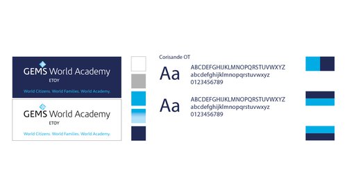
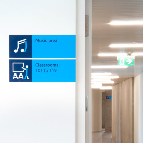
Using the colours and typography of our client's logo and graphic charter, we have, among other things, designed a series of pictograms that take up the building's plan form and become the primary element in the composition of these signs.
Sometimes tinged with a touch of humour, these signs dress the various signage media and inform users, from 3 to 65 years old.
