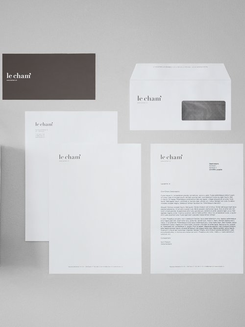
Created for a new delicatessen concept, this visual identity aims to highlight the close relationship that the owner maintains with his customers and suppliers, as well as the quality and delicacy of the products offered.
Elegance is expressed by a serif typography and a choice of sober colors reminiscent of both terroir and luxury. Proximity is underlined by the "apostrophe" sign present in the "Cham'" appellation (which is a reduction of the owner's name).
The "apostrophe" sign, which is used on all communication media (packaging, napkins, stationery, bags, etc.), becomes a recognizable and refined signature.

