Minimalist, intuitive and flexible
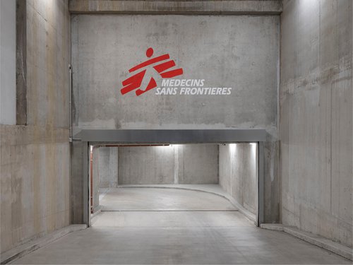
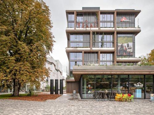
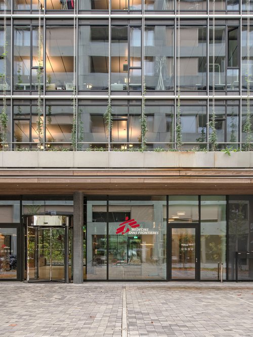
The humanitarian medical non-governmental organisation Médecins Sans Frontières (MSF) commissioned us to design the signage for their new international headquarters in Geneva, designed by Berlin architects Sauerbruch Hutton.
Bringing all the staff together on a site of over 10,000m2, and the resulting reorganisation of MSF's departments, services and sub-services, led us to propose a new, intuitive and flexible wayfinding system that could easily absorb any future organisational changes.
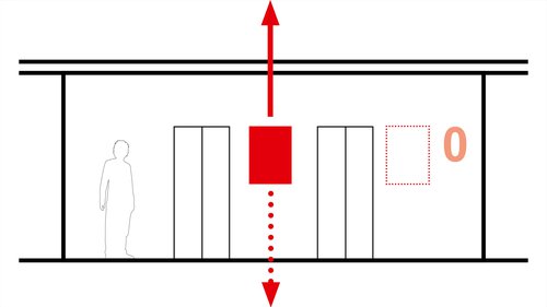
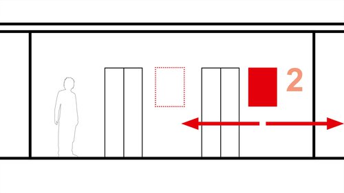
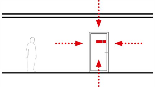
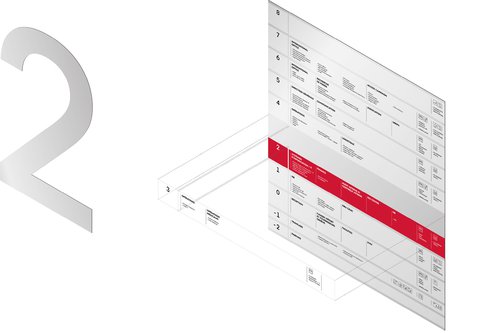
Based on the differentiation between "unchanging" orientation information and that which could be "modified", we determined 2 distinct orientation axes, systematically grouped together at the main traffic nodes:
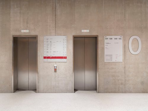
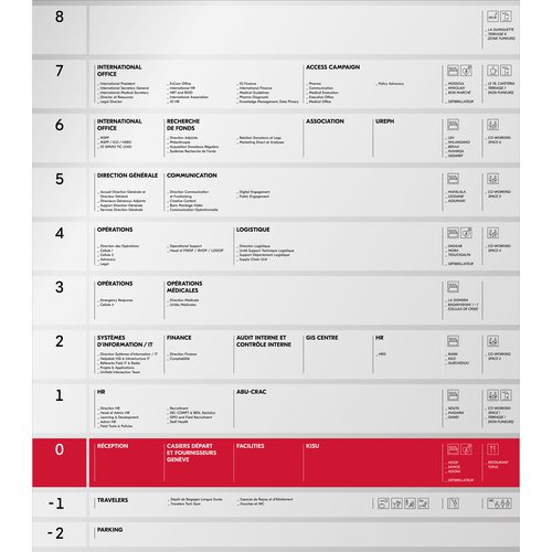
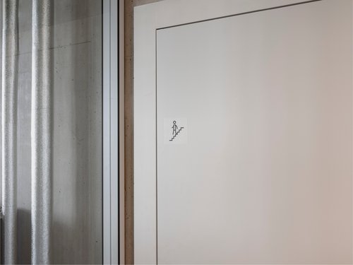
Vertical axis, top-bottom panels: overview of all the building's programmes, by floor.
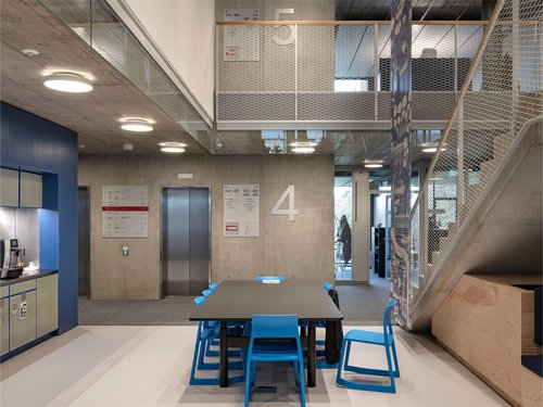
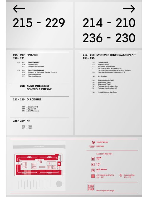
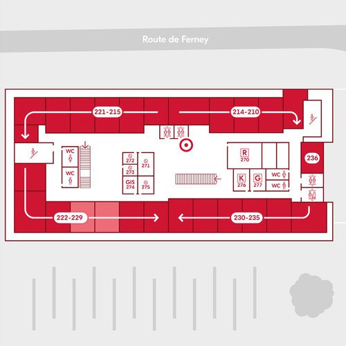
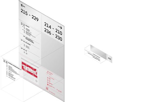
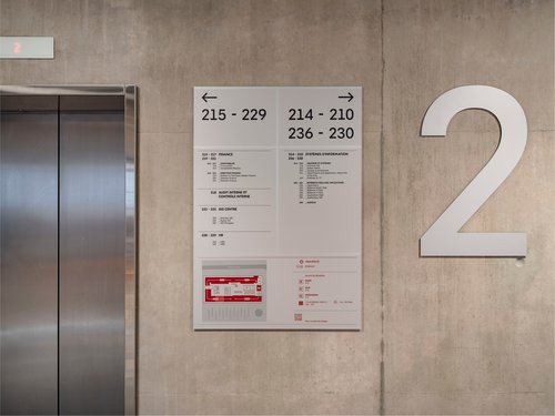
Horizontal axis, left-right panels: an overview of all the programmes specific to the floor you are on, with directions to the destination you are looking for.
This principle has enabled us to minimise the amount of support required for optimum orientation, while limiting the amount of information that can change, thereby reducing the overall cost of intervention and operation.
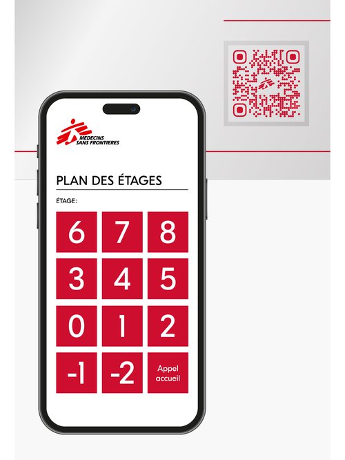
Designed with a simple materiality that blends in harmoniously with the architecture, the physical supports are combined with a QR code system that gives users a comprehensive view of the building via an interactive document that can be downloaded and easily updated at any time.
Year
2023
Developed by
CCHE Design
Client
Médecins Sans Frontières
Program
Identity, orientation, and system signage, exterior and interior, for an 11-storey building (10,000 m2) with administration, restaurant, and car park.
Procedure
Invitation to tender
Realization
CCHE Lausanne SA
Contractor: Notabene Pelfini Gravure SA
Signage
CCHE Design
Vertical axis, top-bottom panels: overview of all the building's programmes by floor, indicating "invariable" general information (floors, departments, services, conference rooms and common programmes).
Horizontal axis, left-right panels: an overview of all the programmes on the floor you are on, with directions to the destination you are looking for. This panel integrates "unchangeable" information (direction, numbering, simplified floor plan) and "modifiable" information (precise description of departments, services, and sub-services) on separate films, making it easy to update. This panel includes a QR code for downloading an interactive document showing all the building's programmes and their location on each floor.
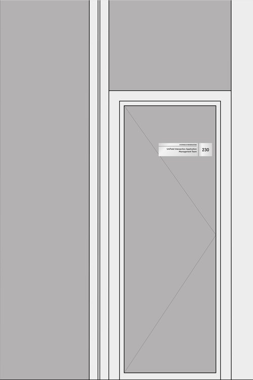
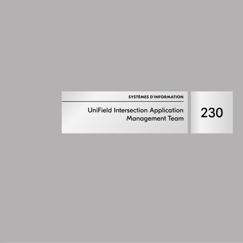
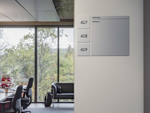
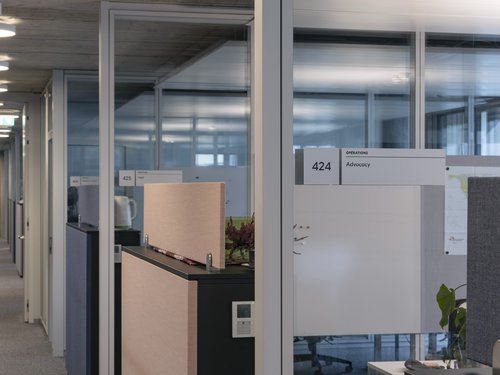
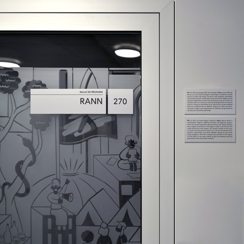
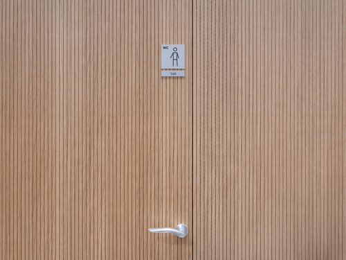
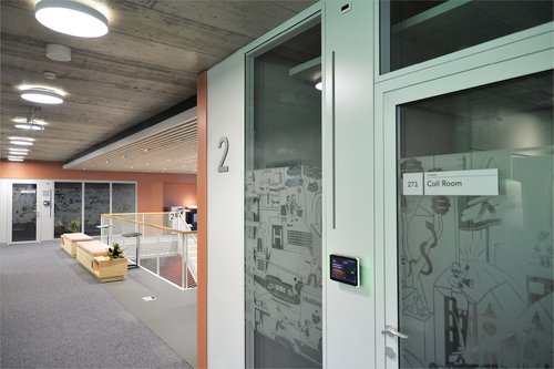
Arrival points: conference rooms, open spaces or offices, numbering, and description of the arrival point (department, service, or sub-service).
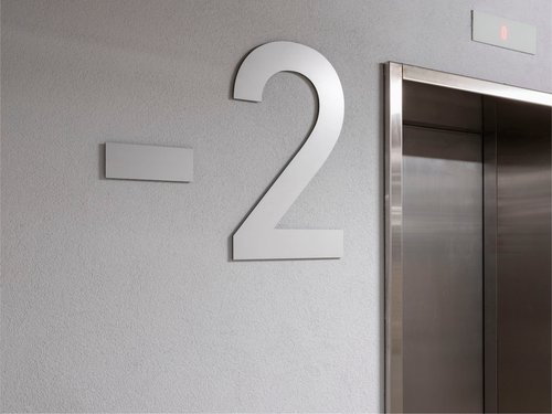
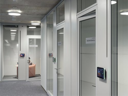
Materials: visually consistent, the signage supports have been designed to blend in with the existing architectural environment, whatever the destination material (concrete or painted walls, doors, and glazing). The information is printed on separate films so that it can be updated only in the area concerned.
Reduce the amount of work required using inexpensive materials, while guaranteeing optimum orientation. Incorporate future changes into the orientation system to ensure its longevity. Production and installation by a local company.
