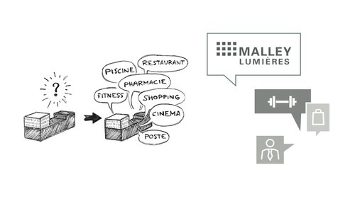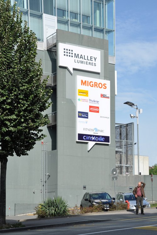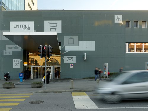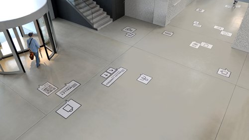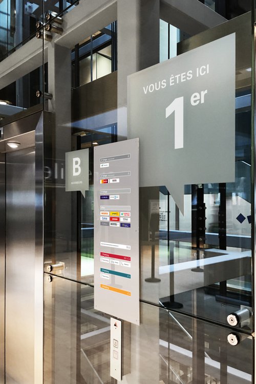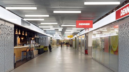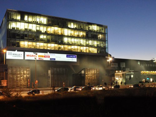
The Malley Lumières complex, designed as an introverted building, brings together a multitude of activities that were not perceptible enough from the outside. Mandated to rethink its visual identity and exterior signage, we had to make passers-by want to enter by making them understand what the center had to offer. In order to do this, we reorganized the signs according to the outside traffic and their visibility, while looking for a graphic principle that would hide the footprints of the old signs on the facade.
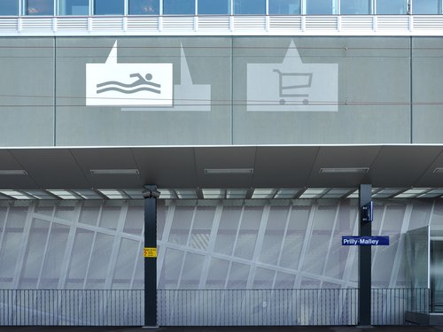
By choosing to make the building speak, we worked on the theme of the phylactery, which with the help of pictograms illustrate the different activities that are grouped there, while respecting the formal identity of the building. The illuminated signs were produced in stretched canvas boxes, backlit with LEDs; the pictograms and phylactery in paint. A playful and playful large-scale realization that will attract attention while intuitively informing future customers.
